TL;DR
Very comprehensive, data and research heavy project for a high traffic ecommerce company co-led with Thoughtworks.

Company Overview
Modanisa is a fashion e-commerce platform that operates in 140 countries with 10 million monthly sessions in 5 languages. It was founded in Istanbul in 2011 and became Turkey's first international online shopping platform and e-export leader for at least 3 consecutive years.
Project Overview
As the company has grown in terms of user base and revenues and expanded into new markets, business model was planned to changed to marketplace to offer faster delivery, easier returns and expanding the market with new suppliers.
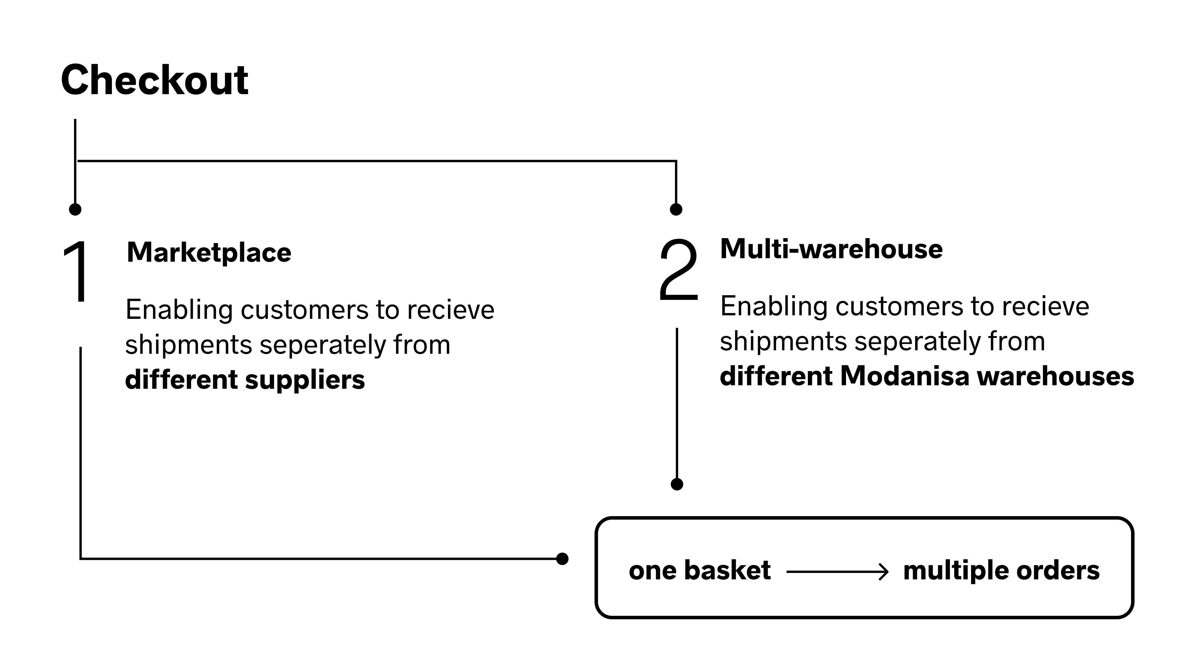
Two big projects have been delivered under checkout. The first project was to turn the platform into a marketplace to provide customers faster delivery, easier returns and a wider product portfolio with new suppliers, and secondly, to expand the logistics network and open new warehouses in other countries to increase user satisfaction.
The project was held with the consulting company Thoughtworks. I’ve joined the company with the beginning of this project and led the product design strategy. Also, in scope of this project the legacy architecture was re-platformed therefore the project scope and size were amplified.
Inception 🎯
In Modanisa, the approach to starting new projects involves using lean inception to identify the business requirements and key features for minimum viable product (MVP) needs.
“Lean Inception is the effective combination of Design Thinking and Lean StartUp to decide the Minimum Viable Product (MVP). It is a workshop divided into several steps and activities that will guide the team in building the ideal product.”
Throughout the inception phase, I collaborated closely with my team and stakeholders to pinpoint user needs, evaluate the product's current status, and identify which features required improvement. I took charge of organizing and leading relevant workshops. Moreover, I ensured that all project participants got to know our user profile and encouraged them to empathize with our persona while making product-related decisions.
Lean Canvas exercise completed by whole team and stakeholders. Blurred due to NDA.
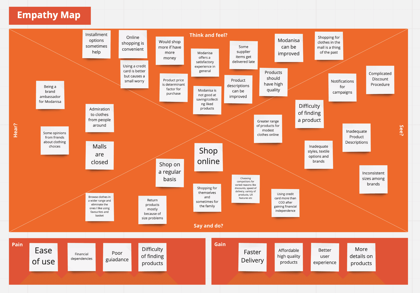
Empathy map created during inception using the insights from interviews to have a better understanding of our persona and their needs.
Roadmap
MVP 1 was aimed at assisting customers in Turkey by providing faster delivery through a pilot supplier. This was achieved by enabling the supplier to directly ship orders from their warehouse instead of utilizing drop shipping, thereby reducing shipping costs.
MVP 2 aimed to enable faster delivery and returns for customers in Europe. This was achieved by opening a new warehouse in Poland, allowing for direct shipments from suppliers to customers, and reducing shipping and return costs.
The final outcome was the implementation of a new checkout system that allowed for worldwide delivery, and the establishment of a new warehouse in the MENA zone.
Moderated User Interviews👩💻
We designed our questionnaire to gather information about participants' backgrounds, general e-commerce habits, past experiences with Modanisa (both positive and negative), as well as their experiences with our project-specific checkout and other marketplace features. We carefully considered the feedback received from relevant stakeholders when shaping the interview questions and format.
1 hour meetings with 10 customers from different countries and segments are scheduled (high frequency and high volume buyers) with the help of our CRM and Customer Care team to;
Identify key problems and opportunities
Identify customer behaviors and patterns
Understand their needs and aspirations
Validate the user journey
Come up with relevant marketplace innovations
Analysis of customer data
To create our affinity map, we collected quotes from each customer and grouped relevant cards together to derive insights.
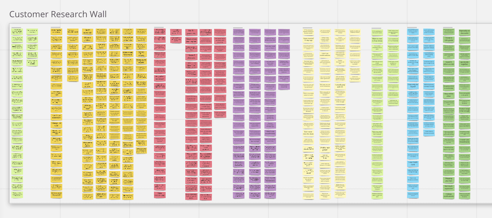
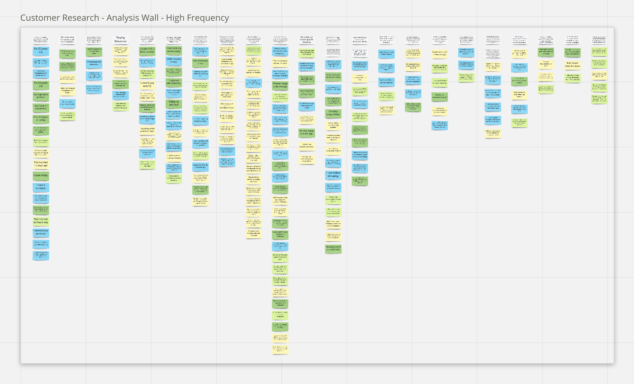
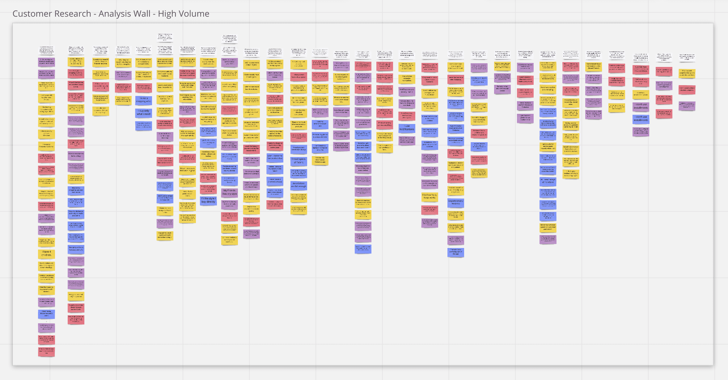
Some of the insights were like the following;
Credit card is by far the favourite method of payment and we haven’t faced much problems during the payments.
We used to shop using Cash on Delivery before, now after gaining financial independence and trust, we are using credit or debit card more and more.
We think that the non-Modanisa products (supplier products) mostly get delivered late as compared to Modanisa owned items because of procurement.
Challenges
Recruitment of customers: To recruit the customers in the fastest way, we offered them a voucher if they participate to the interviews.
Technology Constrains: Due to the pandemic, all interviews were conducted online using video conferencing tools. However, some users who were not tech-savvy faced difficulties and as a result, we were losing valuable time. I created a guideline outlining the steps to download the tool, complete the registration, and seamlessly join the meeting. This guide was proactively shared with participants to ensure a smooth walkthrough and preventing any possible process delays.
Participation: Users often forget the arranged meeting time. I’ve realized it is crucial to remind them with direct communication and confirm their attendance not to waste time.
Unrelated replies / distractions: When asked a question, some users got off track often. To keep them focused on the desired path I’ve paraphrased the questions or find connections to redirect them.
Interviewees who tend to stay quiet: I’ve started all interviews with casual chatting and warm-up questions to make them feel comfortable. Also none yes/no questions!
Distraction while taking notes: We’ve always participated the interviews as one interviewer and one note-taker to prevent any distraction.
Moderated Supplier Interviews 📦
Transforming our platform into a marketplace needed extensive research and collaboration with our suppliers to design a supplier dashboard that serves to their needs in the most effective manner. As a result, we formulated a questionnaire to determine their expectations from Modanisa and identify the pain points and advantages they experience on competitor marketplace platforms. We also conducted interviews with various segments of suppliers, similar to our approach with customers.
Following the interviews, we determined our MVP, and the board of management decided to proceed with the existing supplier dashboard and postpone the new dashboard for future stages. Similarly, the remaining research, analysis, and design for the supplier panel were also paused.
Competitive Research 🔍
Here is the “Let’s check what Amazon is doing” step 😉.
We’ve deep dived more than 15 leading e-commerce websites/mobile applications in Turkey and worldwide like Amazon, Asos, Zalando, John Lewis, Trendyol, Hepsiburada etc.(and a couple of hundred more on baymard.com ) for each interaction.
We have analyzed the following;
Overall Cart and Checkout funnels and how they differ from our product
Address form structures
How order review is displayed
Delivery options
All payment method journeys such as Credit Card, Klarna, PayPal
We generated competitive analysis tables based on various criteria, such as attributes, metrics, and features. Additionally, we looked into detailed aspects such as interactions, messaging, information design, speed to checkout, and number of clicks.
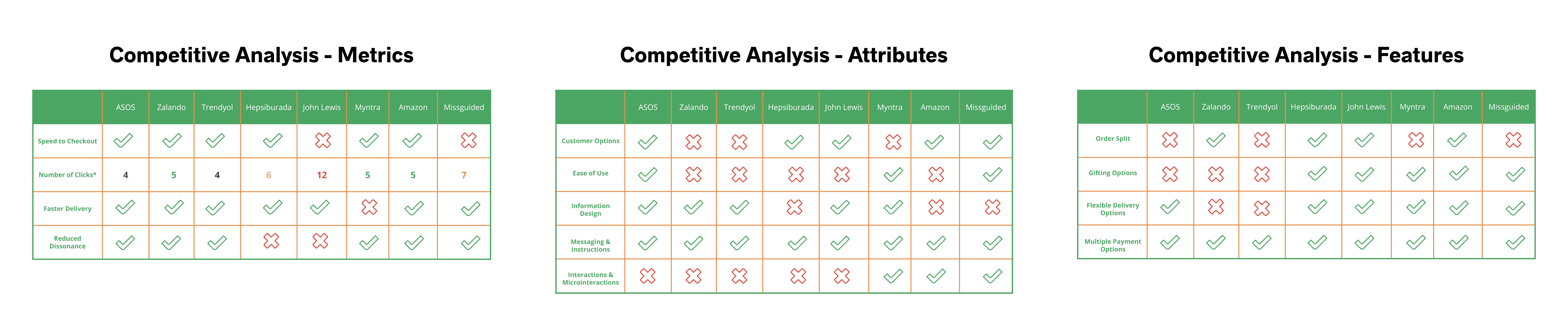
By conducting competitor research, we were able to gain a better understanding of the latest trends in UX design. This research also allowed us to identify the various innovations that our competitors were offering to their users, as well as the strengths and weaknesses of their products. This, in turn, helped us to position ourselves more effectively in the market and identify areas for improvement in our own UX design. Additionally, by examining our competitors' offerings, we were able to identify potential opportunities for innovation and differentiation that we could explore in our own product development.
Data and Research 📊
Following the competitive research and interviews, we aimed to analyze quantitative user data. We obtained data from the tools in use, as well as from our business intelligence department.
Hotjar
We’ve used heat maps, click maps and scroll maps for website and mobile web to analyze patterns and watched session recordings to have a better understanding of user journey and pain points.
Quantitative Data
We have worked with Business Intelligence Team to acquire further data about our users such as;
Average saved address count, breakdown of saved address numbers
Address title analysis; what are the most common titles
Average product quantity per order
Average number of suppliers per order
Average saved credit card count, breakdown of saved card numbers
Breakdown of payment method usage for each zone
So that we can create a baseline for our design decisions and overall user experience.
You can find relevant data & research analysis and how it has been used in the next section in more detail.
Wireframes 🎨
Our design journey started in Sketch but soon after we switched to Figma as a result of becoming an international, remote working team. Utilizing both qualitative and quantitative data collected from users, we began redesigning the checkout feature by feature, prioritizing based on the user stories on our iteration map.
Responsive Web Design and iOS & Android Apps
In the scope of this project we changed our website to a responsive framework. We’ve worked with 4 different screen sizes (320px, 768px, 980px, 1280px) for web in addition to iOS (375px) and Android (360px).
Design System Support
The design system was just being created as part of the re-platforming. I also contributed to the new design system in line with our domain needs.

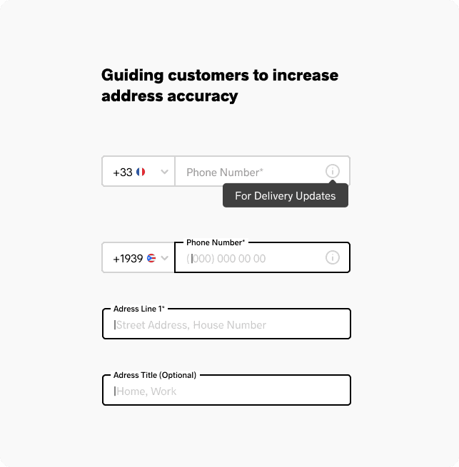
Address Section
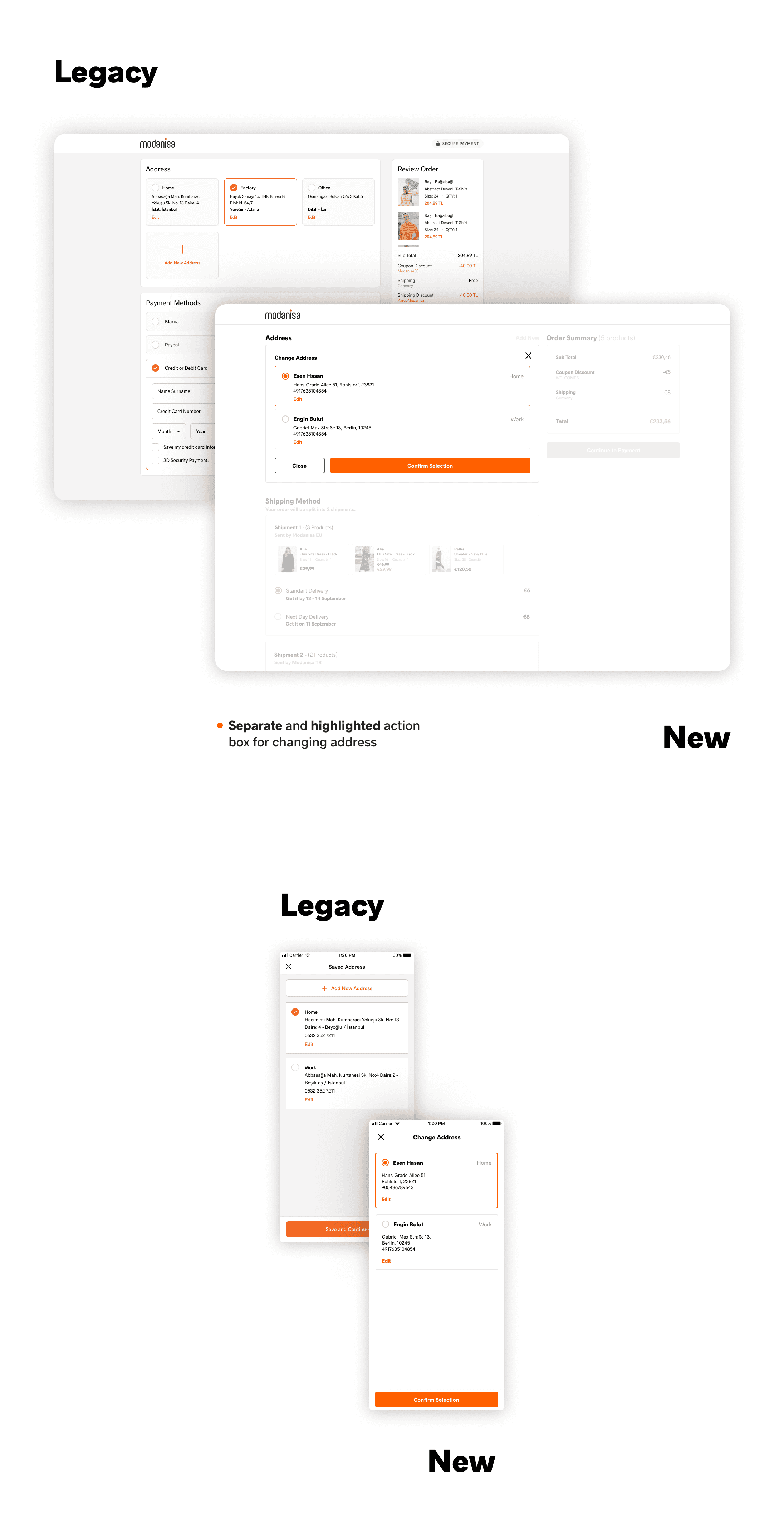
Data showed us that almost 93% of the customers have only one saved address. Current address section for desktop was designed to show multiple addresses and we decided to change the structure.
Showing all addresses in one section was causing an overcrowded look for customers that are using multiple addresses and also depending on the each address’ length, alignment was shifting. By adding a new interface to change the address we aimed for a smoother page design and experience.
Also the highlight of each address was on the address title. When we asked customers to choose what information was the most important when they look at their address to distinguish, their replies were respectively the following; Receiver name (%60), city or street address (%30), address title (%10). We changed the highlight to receiver information instead of the title.
Knowing most of the users are using one address actively and the data above, address title field was changed from required to optional.

Address Form
Structure of the form was redesigned.
After the analysis, we got rid of the fields that we could to shorten the form and left only absolutely necessary information.
Helper texts and placeholders were altered for each zone according to address formats and user habits.

Changing Selected Address
As mentioned above, new interface for changing address was designed to eliminate overcrowded look and confusion for desktop.
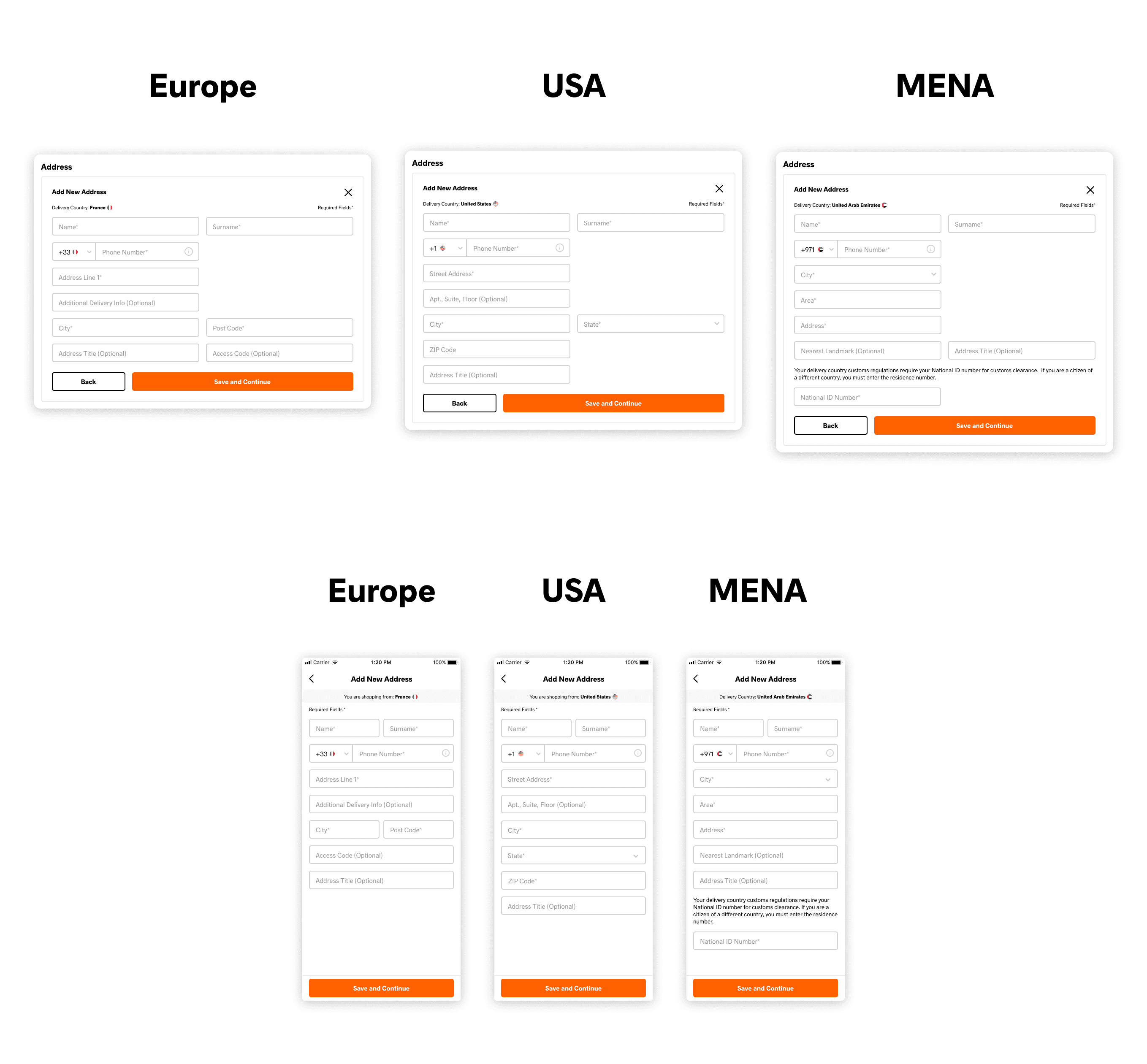
Address Form Localization
With each zone the new checkout was planned to launch we did comprehensive address form analysis. According to each zone’s address format we designed localized input fields, helper texts, placeholders.
As a result of our collaborative work with with our logistics department, we identified the fields where the most mistakes were made when users enter their addresses. We have improved the form based on the data and insights provided by data and logistics departments. Our aim was to increase the address quality by preventing returned packages due to faulty addresses, reduce drop offs and reduce the cost of returns.
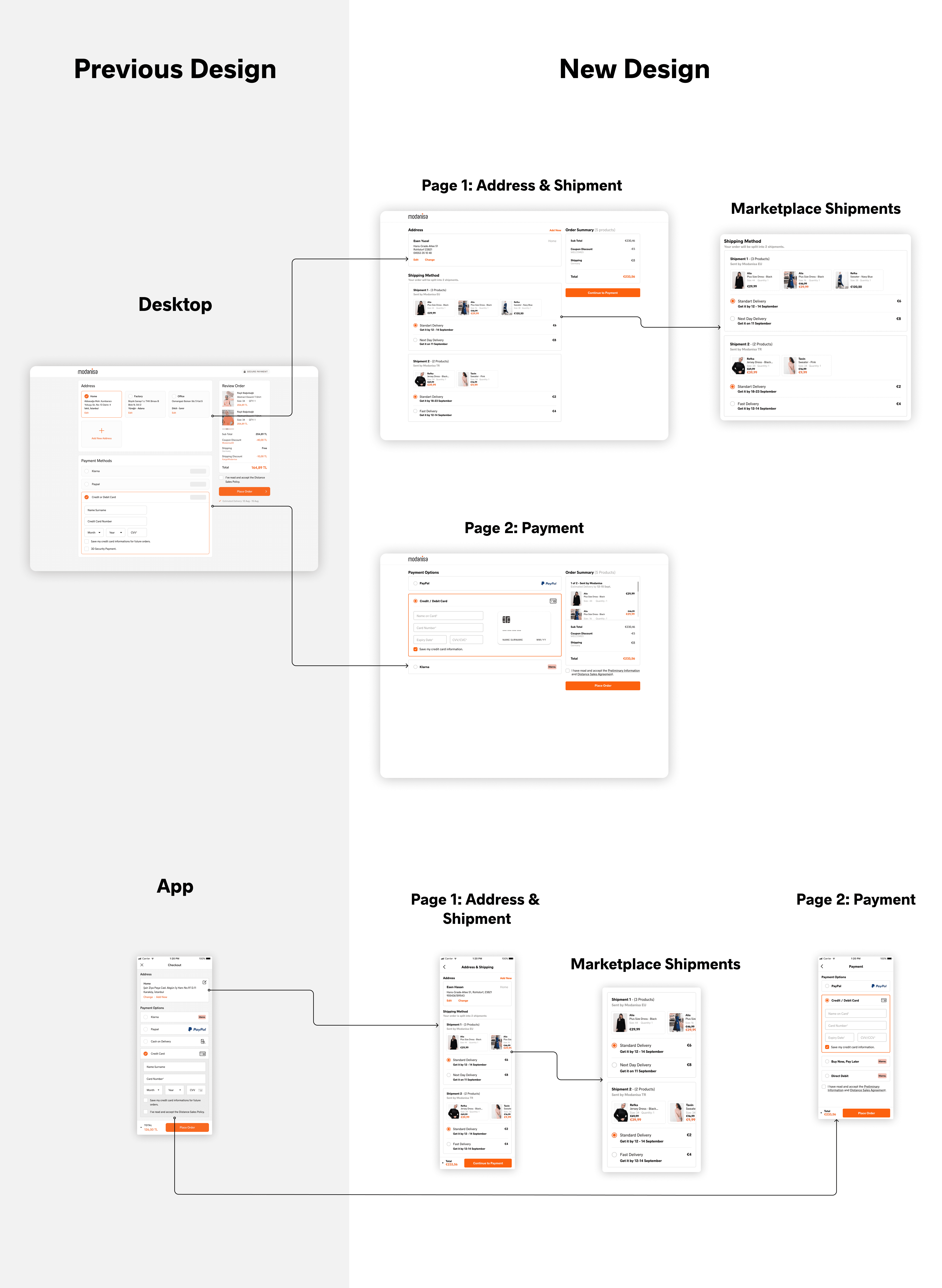
Order Split & Order Review
How to show customers that their order will be shipped by different packages was the most challenging part. For ten years customers never had this experience when using Modanisa and it was going to be a great change. The more accustomed way for users is to show shipment arrangements on the cart but cart page was out of our scope due to legacy dependencies. There were not many examples of this kind of experience so we had to be very clear.
After designing many drafts and doing a lot of research we decided to split our checkout into two pages. First being the address and order review and the second being the payment. The decision was made to decrease the cognitive load and prevent having a long, distracting checkout.
Main reason we decided to go for a 2 page checkout structure was the obligation to add a whole new section for shipment details and selection for some cases. Since the cart was out of scope, it has to be done on checkout. Keeping everything in one page would mean too much scrolling and crucial areas like payment staying under the fold.

Credit Card Form
We’ve kept the form as briefly as possible. For a better guidance, we used a 3D Card animation when entering card details for desktop web.
Main reason we decided to go for a 2 page checkout structure was the obligation to add a whole new section for shipment details and selection for some cases. Since the cart was out of scope, it has to be done on checkout. Keeping everything in one page would mean too much scrolling and crucial areas like payment staying under the fold.

Saved Cards
Just like address section, all credit cards were listed on the checkout. We’ve changed the flow for using a saved card/changing the saved card.
Data showed that the average number of saved card per user was 1.09. Using this, we designed a section to show only one saved card.

Klarna
Previous payment flow for Klarna was to show all different types of payment methods in one very long form. We listed all different Klarna methods as separate payment options.
In addition to this, we stopped displaying Klarna forms in our checkout and redirect customers to Klarna interface for a smoother purchase. This was decided with Klarna.
Most important improvement was adding an email address field to Klarna Payments. Klarna requires an email address and just because of that there was a mandatory email address field in address form. Adding the field inside the payment method helped us minimize the address form.
The message shown to customers was almost in the form of an error message with and attention icon and an unnecessarily alarming title. This message structure was changed to a neutral message without losing the importance.
Paypal
We’ve used a Paypal Checkout button in our new design to ensure customers especially new comers.
Just like Klarna, information message designed to be less like an error message.
Cash on Delivery
User interviews and quantitative data showed us that we still have a major group of users who prefer to pay on delivery instead of online payment methods for specific countries. We’ve improved overall flow including OTP confirmation. Hotjar recordings helped us greatly to observe pain points.
Order Success Page
With the new marketplace business model, we were required to show all shipments and estimated delivery dates.
Multi-warehouse Alternative Design
This was the most difficult and challenging part of our project. With the warehouse to be opened in Poland, we had to show a new business model to the users in the second step of the project. With this design, which we will only use for a short time with the decision of the executives and stakeholders, we were expected to offer the user a two-stage delivery choice. At the first stage, we wanted the user to choose whether they wanted to receive their order in separate packages or in a single package, and then determine the delivery method (standard, fast, next day) according to their choice. Although we tried to explain as a team that this experience was challenging for users, the BI department forecasted that this would be the most profitable model as a result of their analysis. They wanted a model with a high development cost for an estimated period of only 6 months.
Development & Teamwork 💻
Our delivery cycle starts with the product owners writing the user stories. During the analysis phase of each story, we ensure that the designs are available. Once the stories are written, the product designers, developers, and quality assurance teams review and sign up for them. Upon receiving approval from all parties, we initiate the development process. After the developer pair completes all the acceptance criteria specified in the story card, we arrange a Dev Box Testing session where all parties assemble to review each AC, check the user interface, and provide feedback if needed.
Prototype Testing 🔬
We wanted to test our new designs using Useberry before going live. We created prototypes for different scenarios such as placing an order, using a new address, editing an existing address etc.
Upper management had some concerns sharing our new design with public before going live and hence prototype testing was cancelled. Solution was to test the product after going live with the pilot supplier products.
Usability Testing 👍
As part of the MVP planning, we chose a low-traffic supplier for the trial period. However, since the project scope was complex and required multiple integrations, we needed sufficient time to test and ensure that everything was functioning smoothly on both the front and back ends. During this period, we also scheduled usability tests with our customers.
Technique
Moderated user testing with think aloud protocol
End to end testing from search to payment
Mode
Remotely over Google Meet
Device
Desktop version on Chrome/Firefox
Mobile version on Android/iOS
Pilot Interviews
In preparation for customer testing, we sought feedback from volunteers within the company to improve our testing process. Through three interviews, we investigated ways to enhance the process. We acted on the feedback we received by making our script more precise, identifying and addressing any steps that caused confusion, and resolving a couple of technical issues with payments, which we delegated to the team. Once all the issues were resolved, we were ready to proceed with customer testing.
Sample Tasks
Path 1
Scenario: You’re shopping for a shawl and you want to receive it at your new office address.
Instructions: You would have a basket with items, you need to proceed to checkout from here and add your office address for the shipment.
Path 2
Scenario: You’re shopping for a shawl and you want to receive it at your saved office address instead of your home address.
Instructions: You would have a basket with items, you need to proceed to checkout from here and select your office address for the shipment.
Path 3
Scenario: Your office address has changed and you want to update your address while shopping for the shawl.
Instructions: You would have a basket with items, you need to proceed to checkout from here and use your new office address.
80%
successfully completed all tasks
100%
will continue using this product
90%
happy about the changes we made
Improvements After Usability Test
Address Form
Biggest observation we had was seeing customers struggle slightly completing the address form. We’ve shorten the form once again, changed the layout, corrected some of the wordings to make the form more clear.
As a result our drop off rate was down 12% compared to version one.
Problems with 3D Secure Payment
We’ve witnessed a big amount of payment failures due to 3DS payments and reported this to our team and fixed the problem.
Other reported bugs
We were able to catch some bugs that our QAs couldn’t find before. Some examples are; alignment issues on some mobile phones, unresponsive buttons or links, text size problems. We teamed up with QAs and took those bugs in our backlog and fixed.
Readability & Accessibility Fixes
We reorganized the the text system to make the checkout more readable by fixing font sizes, weights and colors.
A/B Testing 🆎
At present, we are in the process of developing our A/B tests. We are dedicated to thoroughly testing our ideas and ensuring that they provide the best possible experience for our users.
Learnings
🧠 What have I learned?
Lean agile methodology
Being part of a big international team
How important it is to be always in touch with other roles in my team like developers or product owners as well as stakeholders
Cross collaboration with many different roles
Scalable design; how to think ahead while designing and also spot possible problems
Problem and crisis solving (a lot 🙂)
Deep understanding of checkout structure and user behaviors
Finding the middle ground between design and development or user and business
🤯 Challenges I’ve Had
I was new to the company and lean agile. I’ve had no time to had a proper onboarding due to strict timeline. It took a lot of extra effort to adapt.
The change in the structure of the IT department and the fact that the domain system was still not fully settled sometimes slowed things down.
The company's repositioning of all developers as a full stack and my team's weakness on the frontend caused the work to be returned constantly and many bugs related to the UI.
The company's repositioning of all developers as a full stack and my team's weakness on the frontend caused the work to be returned constantly and many bugs related to the UI.
The implementation of an infrastructure change and trying to complete a large project at the same time lengthened the learning curve and made it difficult to meet deadlines. For example, the necessary implementations for A/B testing were thrown into the background due to infrastructure problems or project prioritization. This caused us to go blind at some points.
Roadmap/decision changes after starting the project caused some of our work to be done in vain.
Legacy dependencies and technical setbacks tied our hands for some of the improvements we’d like to do.
Designing for 5 different languages
⏮️ What I would do differently?
Prioritizing pre-deployment testing and getting feedback from users more often while designs are still in progress.